We’ve all seen bad marketing pieces before… the kind that make you scratch your head or give you a headache to look at. They’re tough to read, or they’re tough to comprehend; they have errors or even completely inaccurate information.
Look, graphic design is hard work. Anyone who says it isn’t might just be trying to pull the wool over your eyes! Creating a marketing piece that is balanced, pleasing to look at, and informative is something that can’t be done by just anyone with a copy of Adobe Illustrator software; it’s really an art form, and it has to be done just right or else it seems heavy handed, disorganized, or just awful.
Take, for example, this piece, which was submitted to Reddit’s ‘Crappy Design’ about a month ago:
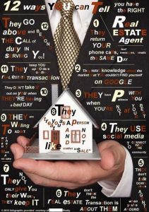
I’ve blanked out the company’s name at the bottom of the piece; names changes to protect the innocent and all that. Initially, I was thinking that an agent or the broker’s assistant or something had created this, but sadly, the agent or brokerage who circulated it might actually have paid someone for it. Believe it or not, there are plenty of self-titled ‘graphic designers’ floating around looking for commission work.
For the sake of making sure everyone understands what’s wrong here, let’s just go through the primary points, ANY of which should have made a proofreader say, “No, we can’t print this.”
For starters, it’s very difficult to read. Why? Probably because the creator liked the idea of mixing type faces, font sizes, font styles, font colors, and even text direction! You should never have a sentence or phrase that has 8 different colors (white and red), styles (bold, italic), direction (vertical, horizontal, angled), and sizes. It just shouldn’t happen; this style of text looks like each letter was cut out of a magazine for one of those creepy ransom letters we see in the movies.
Aside from all the style, size, and direction issues, the colors more of a distraction than anything. When you see a word, and some of the letters are a different color than the rest, it’s typically for a reason; maybe the different colored letters make up their own word, or maybe the different colors represent a brand. In this case, the different colored letters don’t seem to have any rhyme or reason, and to make matters worse, one of the three colors used is a dark maroon, which is difficult to see at all on the black background.
I feel bad picking apart this marketing piece… the person who put this together probably put a lot of time and effort into it, and I’m not doing this to be mean-spirited. I’m trying to give the creator some credit; at least the 12 points they make are good, with a few minor exceptions. Number 5, for example, says: “They don’t talk down other agents when you’re around.” But in an ideal world, agents shouldn’t “talk down” other agents at all, regardless of who’s listening. Constructive criticism is one thing, but the wording here seems to say, “Oh, they’ll talk bad about other agents, just not when you’re around.”
If you make “graphics” on your own sometimes using nothing more than Microsoft Word or PowerPoint, don’t worry, you’re not alone; it works in a pinch. Graphic design can get expensive, and sometimes you just need a quick ‘yadda yadda yadda’ for your Facebook page or a blog post.
In an effort to prevent future marketing pieces that are similar to this one, I just want to share that there’s several places on the internet that you can buy really inexpensive layouts/templates for flyers, brochures, PowerPoint presentations, etc. One of my favorite places is Envato Market (full disclosure, these are affiliate links. I don’t make any money off them but it could save me money on my future Envato purchases).
For example, here’s a bunch of real estate-related flyers, graphics, presentations, brochures, and more that can be purchased and downloaded for anywhere between $4 and $29. I searched “real estate word” so that it would show me Word document files, that way you’ll be able to edit them using Microsoft Word.
But there’s even more options to choose from if you happen to have any graphic design software, including eye-catching infographics for $10 or less. I mean, look how snazzy this brokerage/agent brochure is for $11. I know you’d want to have something like that professionally printed, so it’s not a total ‘do-it-yourself’ project, but even a CHEAP graphic designer would charge $300 for that!
If you’re just looking to add some text over a photo of a listing, try an app for your smartphone or tablet. Apps like Typorama, Pic Stitch, WordSwag, Layout, Canva, and Under Ink are all either free or cheap, and can work wonders!